
Brand audit · Clean & natural skincare
Primally Pure: what works, and where it could sell more
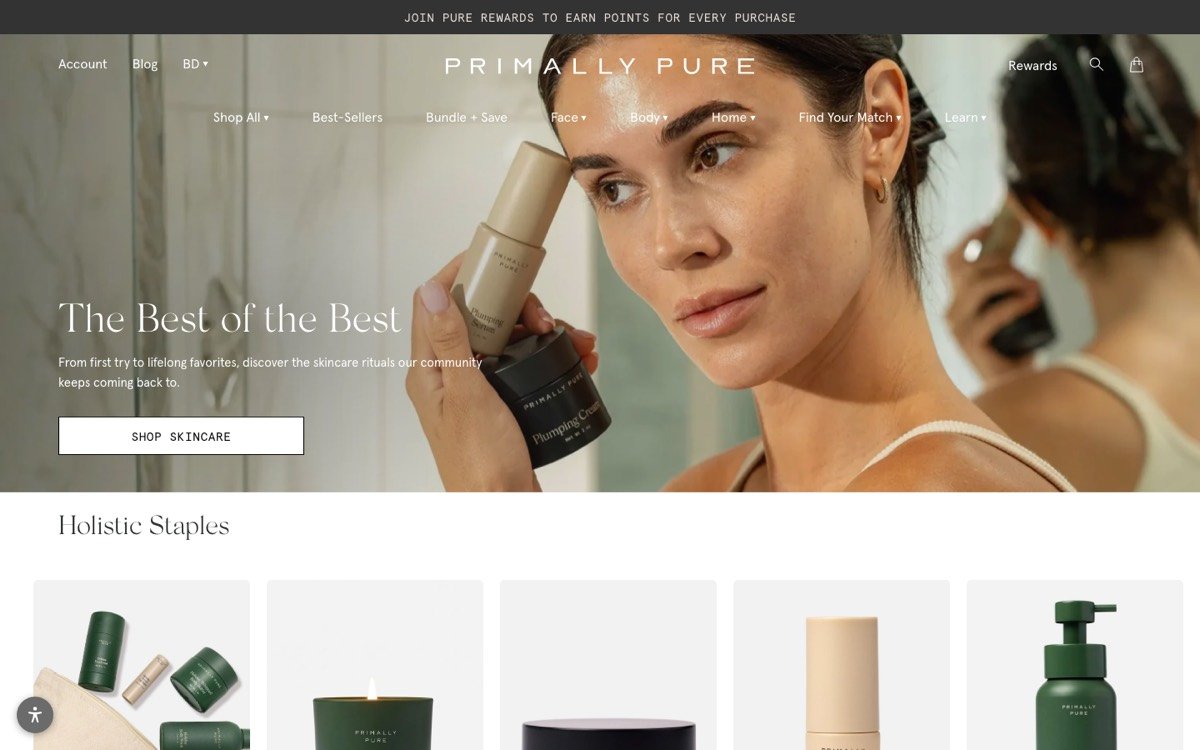
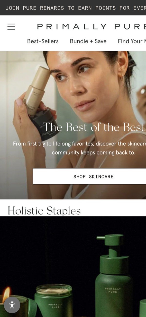
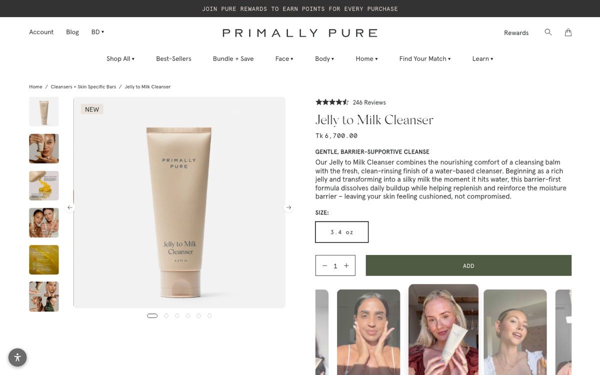
Primally Pure feels honest and unhurried: clear routes into the range, creator videos under the button and a loyalty programme from the first line. The gaps are small and mostly in the page code.
- Brand message
Strong - Look and voice
Strong - Home page
Strong - Product page
Good - Trust and checkout
Good - Found on Google and AI
Good
How to read this: the home page and the product page are each scored out of 100 against the same checklist. The store score is the average of the two. Strong nothing urgent · Good small fixes · Room to grow where sales leak.
Store Page Checker rules, checked by hand · 21 October 2026- Brand
- Primally Pure
- Niche
- Clean & natural skincare
- Pages checked
- Home and Jelly to Milk Cleanser
- Captured
- 21 October 2026, desktop and phone
Doing well
What Primally Pure gets right
- Clear routes inBest-sellers, Bundle + save, a Find your match quiz and a Learn section sit in the menu.
- Real creators under the buttonA strip of creator videos sits right below Add on the product page.
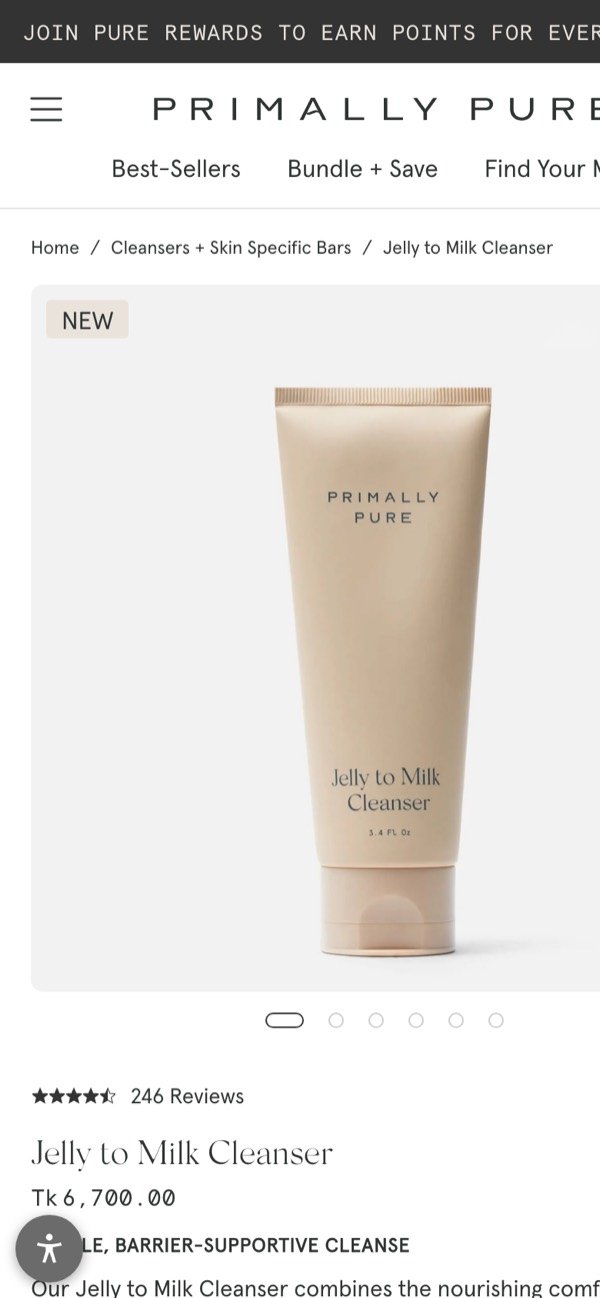
- Plain-word product story“Gentle, barrier-supportive cleanse” and a short description say what the cleanser does and who it is for.
- Search-friendly images74 of 76 home page images have alt text.
Room to grow
Where it could sell more
- One H1 on the home pageThe home page repeats its H1, “The best of the best”, twice.Fix: Keep a single H1 with the brand promise.
- Shorten the product search descriptionIt runs to 320 characters, so Google will cut it off.Fix: Keep it to about 155 characters.
- Add fast checkout by the buttonThe first screen of the product page shows a single Add button, with no express pay or shipping line beside it.Fix: Add Shop Pay or Apple Pay and one shipping line under the button.
If we ran growth
Our first 3 moves
- Give the home page one H1 with the brand promise.
- Add express checkout and a shipping line under the Add button.
- Tighten search descriptions on product pages.
Want this for your brand?
We’ll audit your brand, store and marketing with your own data, then hand you a clear 90-day plan.
- 30 minutes with Hasan
- 3 fixes in 48 hours
- Yours to keep
More audits
Keep reading
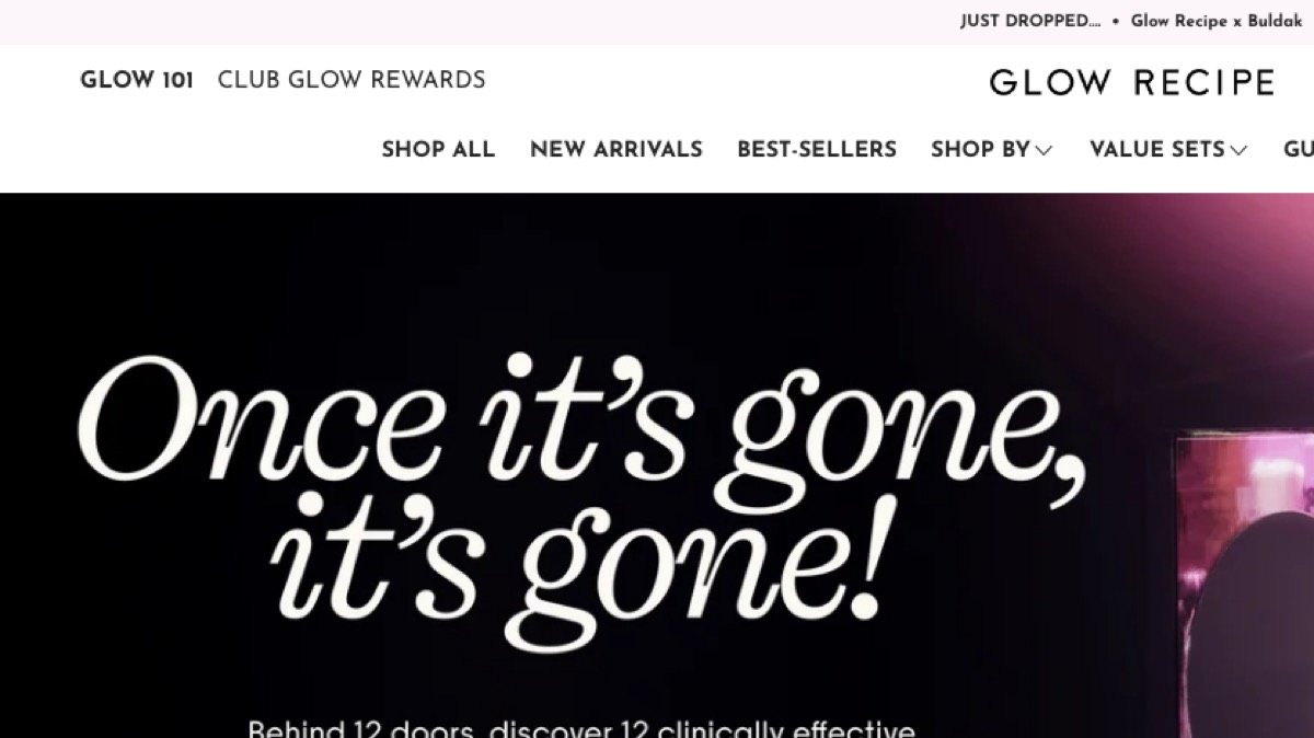 80/100Skincare · US
Glow Recipe
Irresistible product pages. The home page message is locked inside an image.
Read the audit →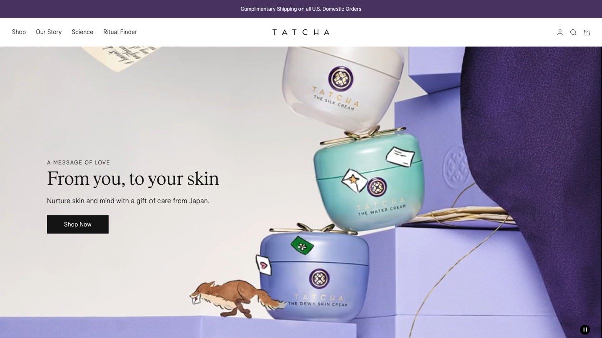 87/100Luxury skincare · US
Tatcha
Luxury done right on the product page. A first-visit pop-up gets in the way.
Read the audit →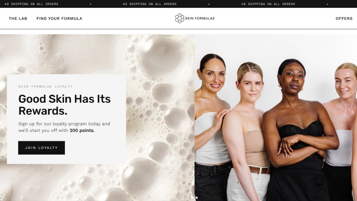 93/100Clinical skincare · Ireland
Skin Formulas
Clinical credibility done simply. Proof could work harder on the home page.
Read the audit →